.png)
International lottery aggregator operating in 40+ countries.
2025 – 2026
Product Designer
Led the redesign of the lottery ecosystem within a 20-person team, transforming a legacy monolith into a scalable white-label service with a token-based Design System and a custom CMS.
.png)
• Conversion Success: Aggregate +22% increase in CR across all regions.
• Operational Growth: Time-to-Market reduced from 21 days to 2 days.Scalability: Successfully launched 30+ unique visual identities on a single codebase.
• User Value: Increased Day-14 Retention by 12% due to improved tracking transparency.
Research & Audit
• UI Audit: Revealed 200+ redundant components and massive inconsistencies across 40+ localized versions.
• Stakeholder Interviews: Identified that launching a new brand took 3+ weeks, leading to significant revenue loss.
%20(1).png)
• Competitor Analysis: Studied Jackpocket and local competitors. Identified an opportunity to combine fintech-level usability with high-end engagement visuals.
%20(1).png)
Jobs-to-be-Done (JTBD)
The Main Job:
"When I feel lucky or a jackpot reaches a record high, I want to safely and quickly buy tickets for multiple international lotteries, so that I can participate in the draw without worrying about the complexity of cross-border payments or ticket validity."
Micro-Jobs:
• Trust & Verification: Confirm ticket validity and track payout status with zero uncertainty.
• Bulk Efficiency: Select and purchase multiple international tickets in a single, frictionless session.
• Decision Speed: Quickly identify high-value jackpots and upcoming draws via visual triggers.
.png)
We moved forward with three core objectives:
Transactional Trust: Overhaul the UX to feel secure, transparent, and professional.
Operational Efficiency: Automate branding to reduce Time-to-Market (TTM).
Cross-Platform Consistency: Ensure a unified experience across Web, iOS, and Android.
B2C Experience Overhaul (Mobile & Desktop)
• Home Page Transformation: Focused on a "Three-Trigger Hierarchy" (Jackpot, Price, Timer). Optimized card density to fit 2.5x more content above the fold.
• Multi-Purchase Flow: Ideated a "Quick-add" interaction, allowing users to select multiple tickets across different lotteries in one session (increasing AOV).
• Status-Driven UX: Redesigned "My Tickets" into a transparent dashboard showing draw dates, winning numbers vs. user numbers, and clear payout statuses.
The Multi-Tenant Architecture
• Semantic Design Tokens: Architected a multi-layered system in Figma (Global > Semantic > Component). Updating a single brand token now propagates across the entire product in minutes.
.png)
• Individual Branding: Hand-picked color palettes for 30+ lotteries to ensure each felt unique while sharing the same underlying code.
• Adaptive Component Library: Built 100+ responsive components using Figma Auto Layout 4.0, stress-tested for long-string localizations (e.g., German/Cyrillic).
• Design Ops: Aligned Figma tokens with CSS Variables, ensuring 1:1 parity between design and engineering.
To solve "Operational Debt," I designed a custom back-office for operators:
Theme Engine: A visual UI for marketing managers to change colors, logos, and banners per region without writing code.
High-Density Data Tables: Designed complex views for Security/Fraud teams to monitor 10,000+ daily transactions.
Safe Publish Flow: Integrated a "Draft & Preview" mechanism to ensure compliance across 40+ regulated markets.
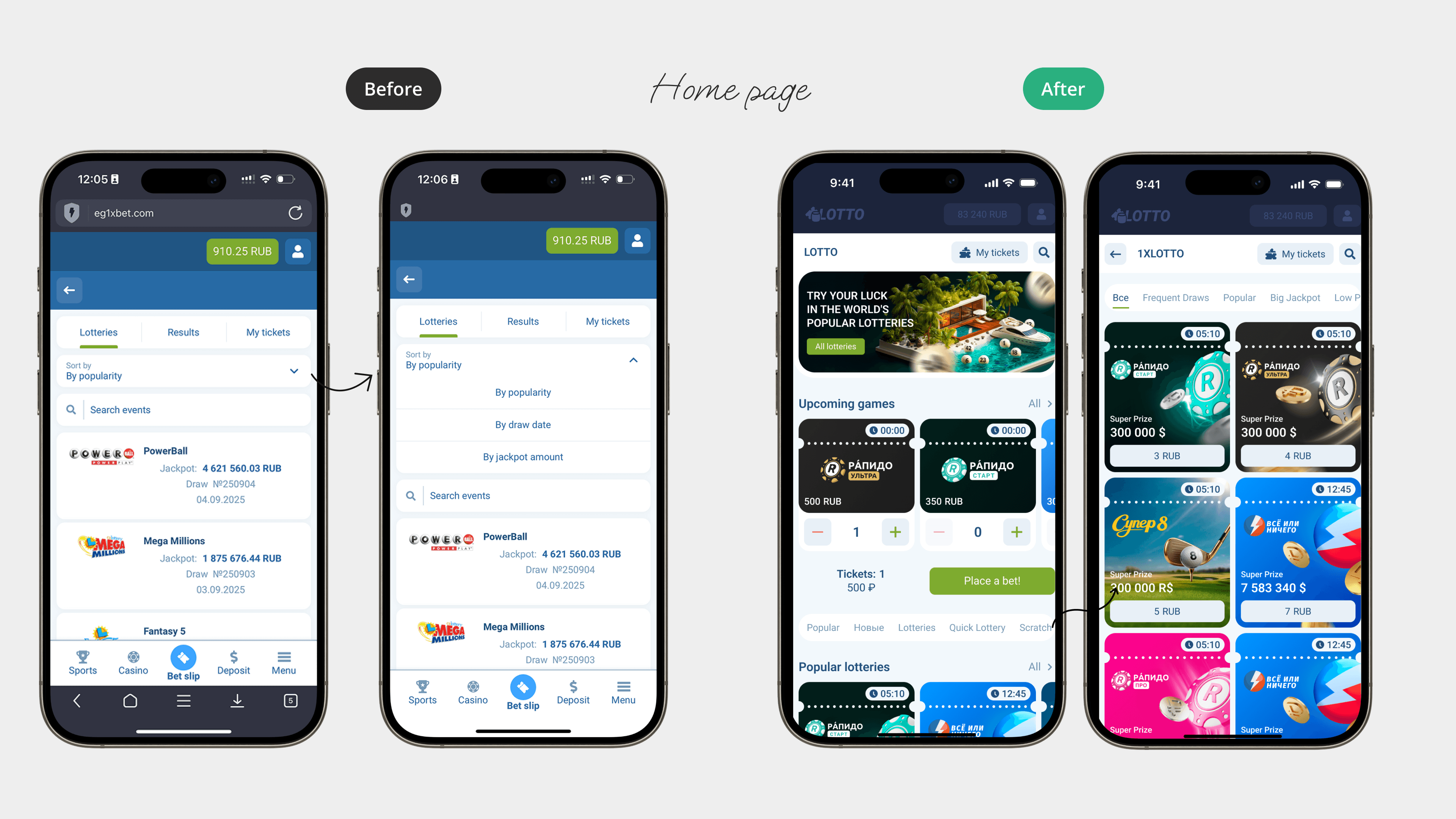
Home Page
Before: Bulky cards, limited search, and basic filters.
After: Compact grid (2 per row), top-tab search to free space, and advanced filters (Big Jackpots, Frequent Draws).
Lottery Ticket
Before: Text-heavy and cluttered flows.
After: Swipe-to-add gestures, unique branding per ticket, and a modal-based purchase confirmation with upsell suggestions.
.png)
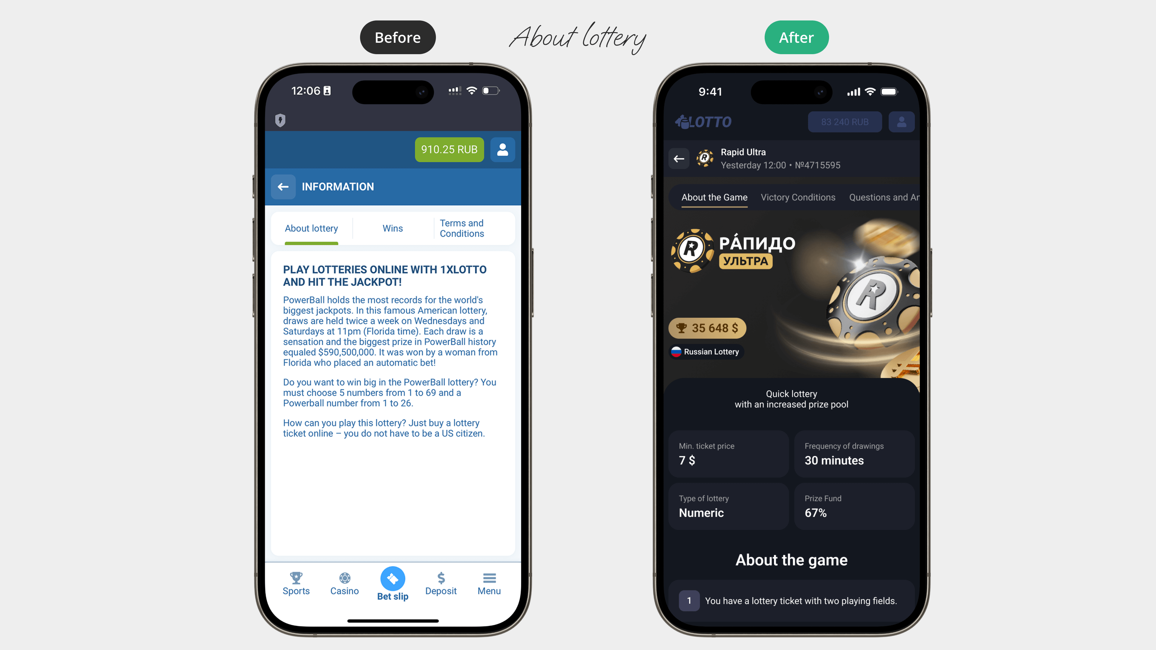
About Lottery
Before: Unstructured wall of text with key rules hidden in descriptions and no clear call-to-action.
After: Branded, high-density layout featuring a Buy Ticket CTA. Key metrics (price, frequency, prize pool) are highlighted in blocks, with content structured into About/Rules/FAQ tabs.
My tickets
Before: Minimalistic list with basic "Not drawn" status; no grouping or filtering.
After: Structured dashboard with New/Drawn/Won filters. Cards now feature ticket counts, total winnings, number matching, and real-time draw countdowns.

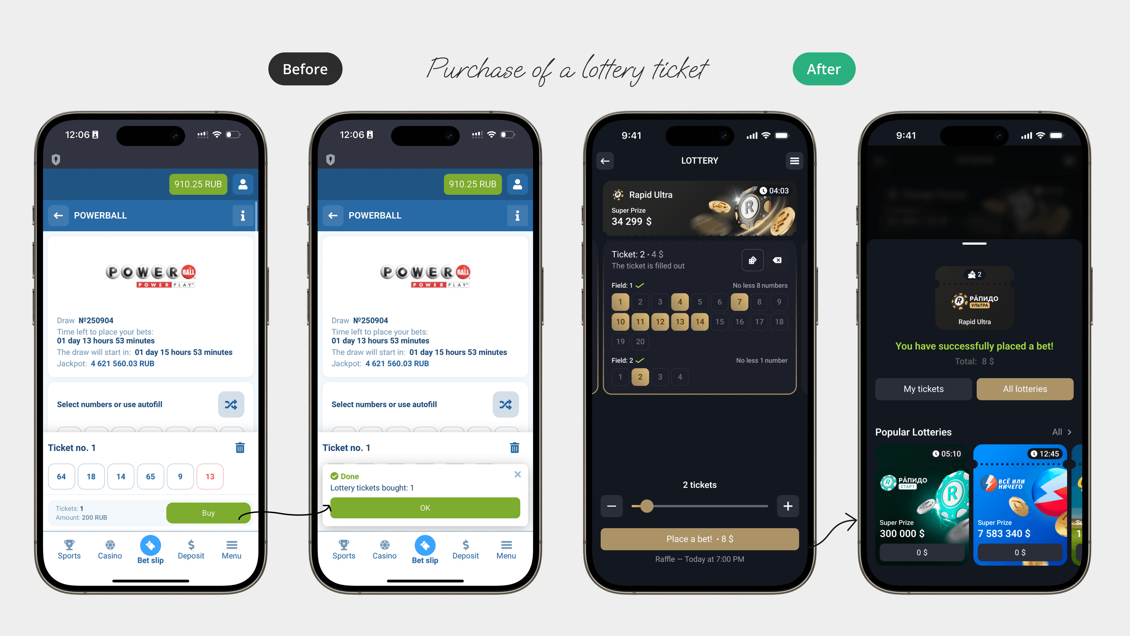
Ticket Purchase
Before: Text-heavy, single-step flow with no visual accents or clear confirmation.
After: Interactive flow with quantity controls and animated modals. Added upsell suggestions and quick navigation to "My Tickets," driving engagement and repeat purchases.
Results Archive
Before: Plain list without navigation.
After: Structured date-based repository (Today / Yesterday / Month), reducing customer support load by 20%.
