I work as the sole Product Designer in a team of five developers. I led the redesign of the platform’s adaptive UX/UI, improving usability and overall user experience.
.png)
Redesigned Tradimo’s adaptive web/mobile experience to make learning faster and simpler for beginner and advanced traders.
+30% task completion efficiency, higher user satisfaction, and better mobile engagement.
Learners ranging from first-time investors to advanced traders, and instructors who need a clear path from course discovery to practice. Interviews and journey mapping revealed friction in onboarding, navigation, and content findability, especially on mobile. We also saw a need for clearer progress and incentives.
• Shorten time-to-first-lesson and reduce wasted clicks in core flows.
• Improve mobile usability for on-the-go learning.
• Increase perceived usefulness/satisfaction after sessions (post-test surveys).
• Target: measurable improvement in task efficiency; achieved +30% during testing.
.png)
.png)
.png)
.png)
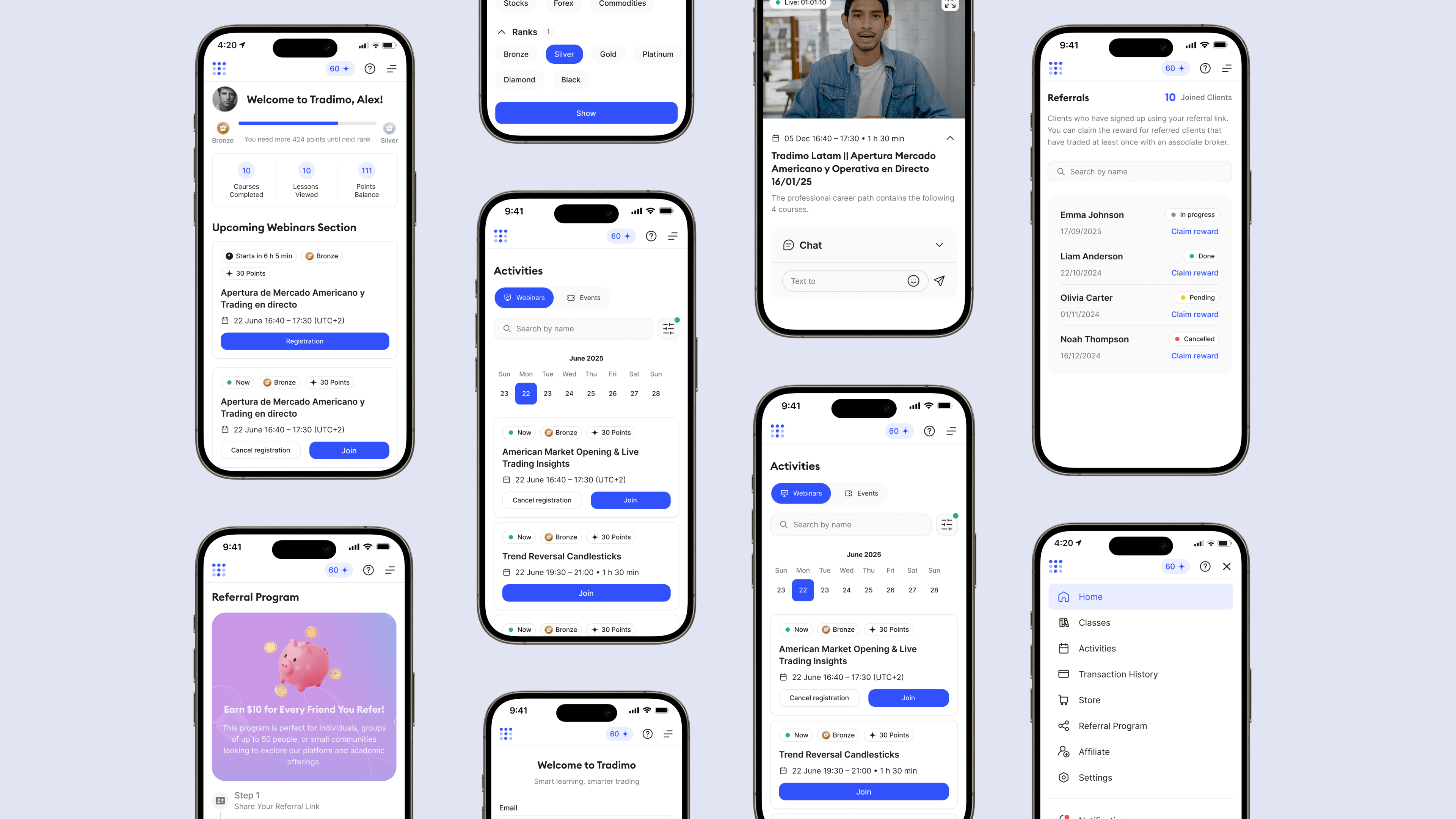
Redesigned the login flow and home screen to simplify access and help users quickly find relevant courses
.png)
Clearer navigation. We simplified the information architecture and labels, reduced cross-links, and added a prominent “Continue learning” entry point.
.png)
Better course discovery. We improved filtering and previews so users can quickly assess level, format, and requirements.
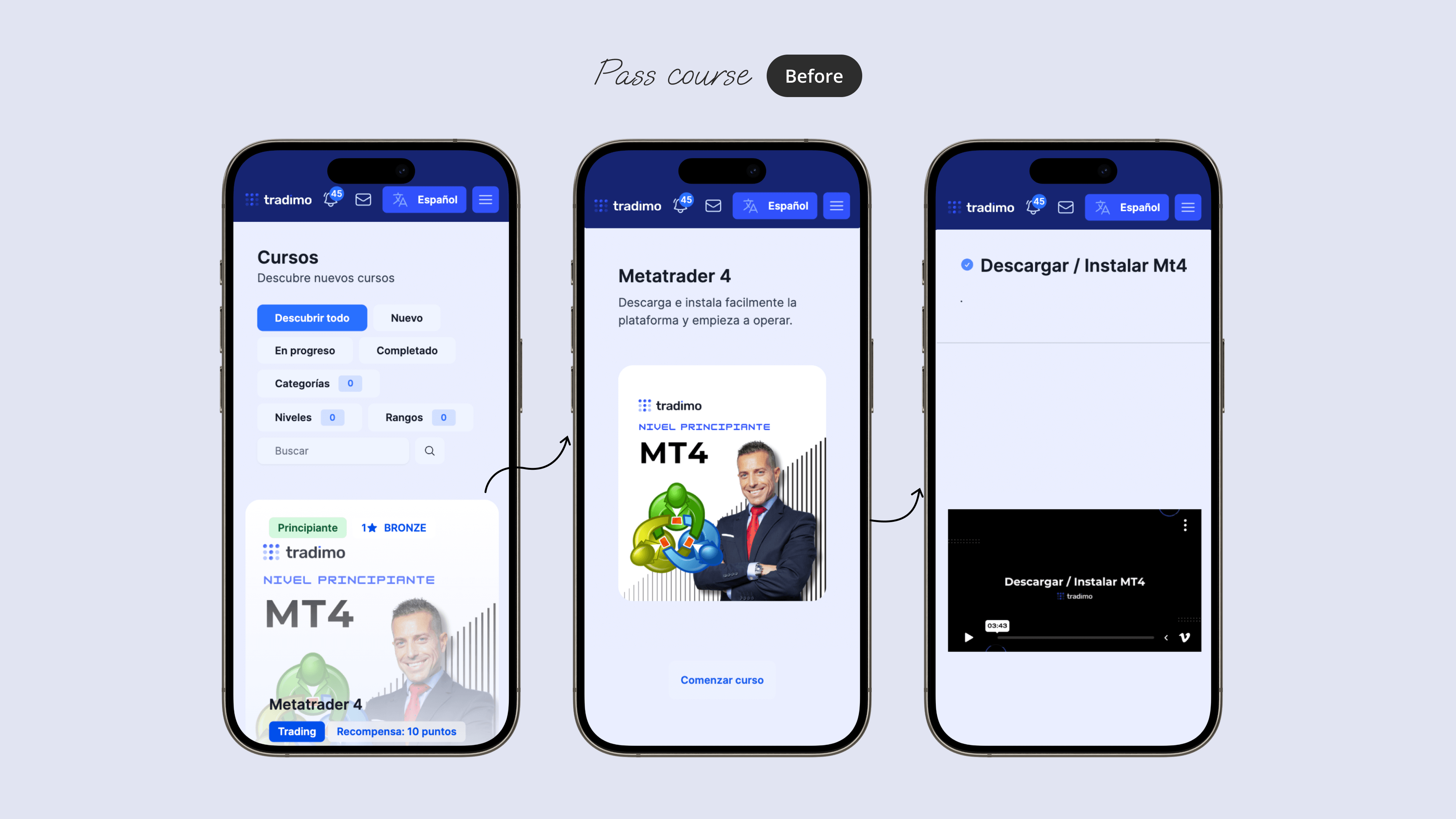
Webinar flow. We created a single place to join, set reminders, and rewatch.
.png)
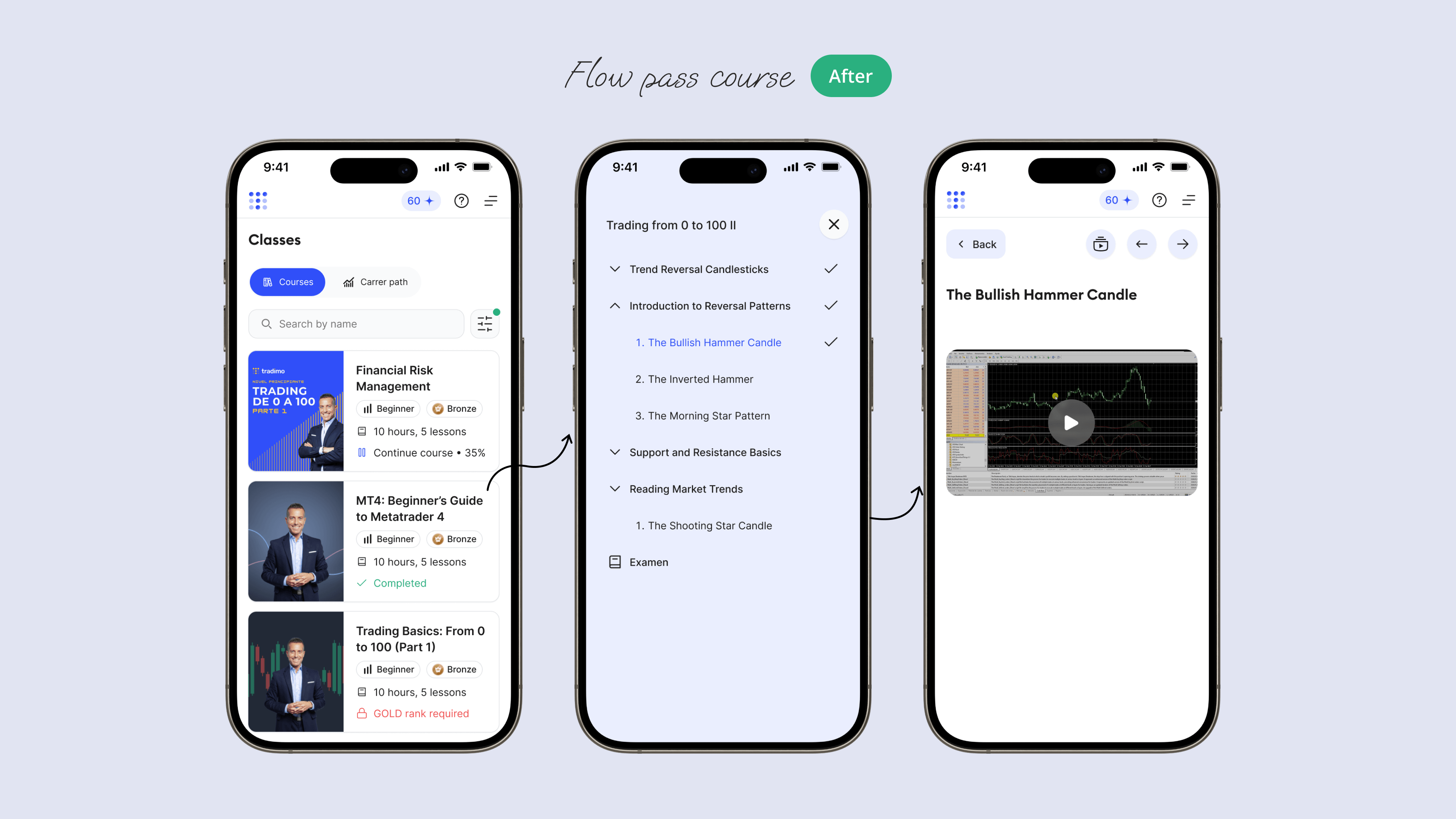
Motivation loops. We surfaced referral and coin rewards where they matter most, for example after progress and completion.
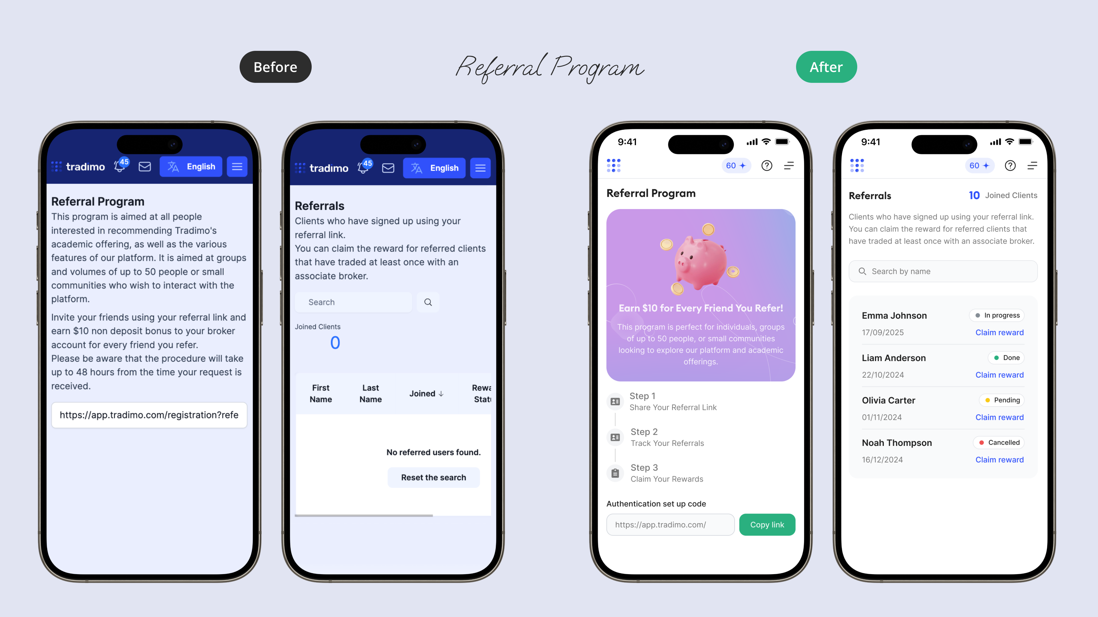
I redesigned the purchase flow by replacing scattered pages with a unified, searchable catalog and a quick modal product view that surfaces key details, point price, and status—putting a clear “Buy” action up front and shortening the path to purchase on mobile.
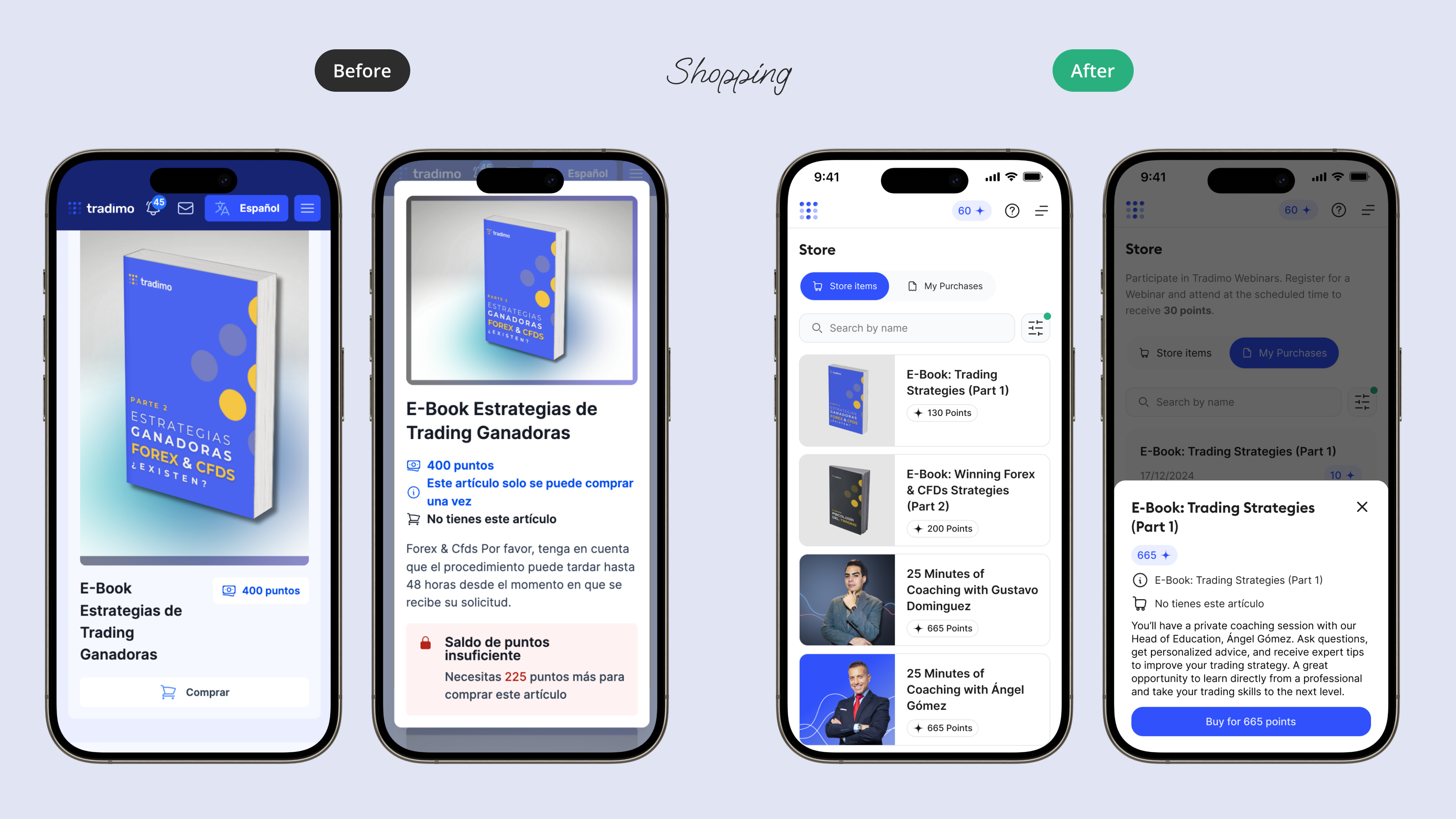
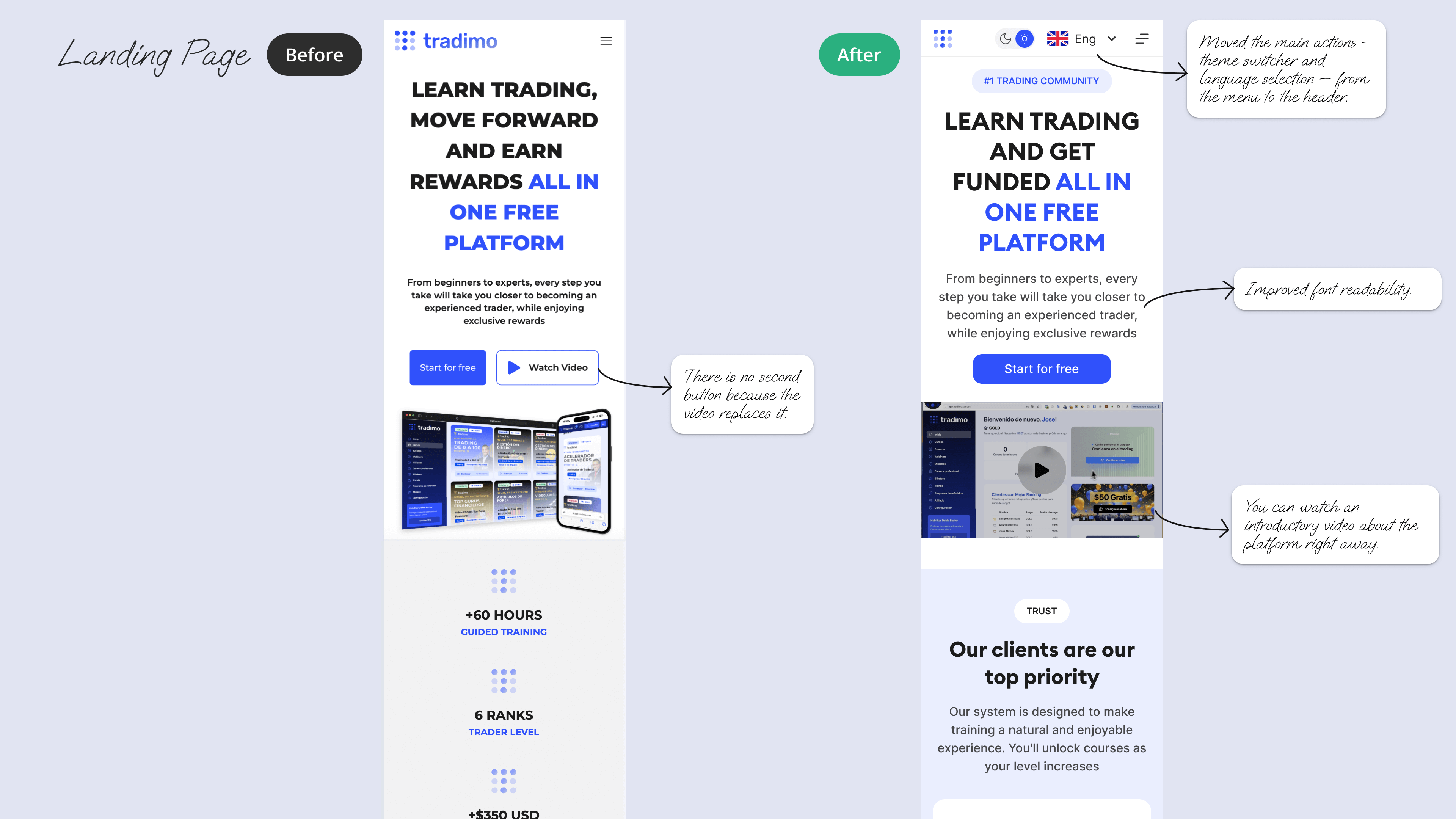
I redesigned the landing page for a broker’s educational platform to improve clarity, visual hierarchy, and conversion. The new layout simplifies the hero section, improves typography readability, and focuses user attention on the primary call-to-action. Key actions such as language and theme switching were moved to the header for better accessibility, while the introduction video was integrated directly into the page to help users quickly understand the platform’s value.
.png)
• 30% improvement in task completion time in core journeys.
• Higher satisfaction in post-redesign surveys.
• Better mobile usability and engagement across devices.